
Lab 4
Contents
- Fundamentals of Machine Learning (ML)
- Introduction to ML pipelines
- Case Study: Predicting Air Pollution Levels Using IoT Sensor Data
- Air Quality (UCI) — Columns & Meanings
- Deployment of Trained Models
- Classification example
Fundamentals of Machine Learning (ML)
As discussed in the lectures, as a ML architect the first thing to do is to understand the users, service, and operational environment. Once the methodological framework is followed to establish the technical requirement specification, it is often useful to think of how proposed solution integrates rest of the data processing pipelines.
Introduction to ML pipelines
In production ML systems, the goal is to build plumbing that allows development, testing, and deployment of ML models. The goal is never to build one ML model. The focus on plumbing rather than a single model is natural due to dynamic nature of the use-cases. As the operational features change, one also needs to update ML model. This ensures drift in data, assimilation of new features etc. can all be incorporated to improve ML model over time.
The task of creating such plumbing is known as creation of pipelines. The ML pipelines are vital to the successful production system design.
Building Pipelines
ML Pipelines organise the steps of building and deploying the model into two main functional categories:
- Delivering predictions: The pipeline is curated to deliver predictions from the model to end user or an end point.
- Model MLOps: The pipeline allows updating the model and perform ML operations(e.g. testing, training, etc.). Furthermore, the MLOps pipeline at high-level can be divided into tasks specific pipeline:
- Data Processing Pipelines: These fetch new data to process, transform, sanitise and extract features for both training and testing.
- Training Pipeline: These Pipelines train ML model on the data fed through data pipelines. Often even model selection can be part of the pipeline using approaches such as AutoML.
- Validation Pipeline: These pipelines validate the models trained.
A very detailed introduction to the topic is provided by Google "Click here". A snapshot of overall pipelines is shown below:
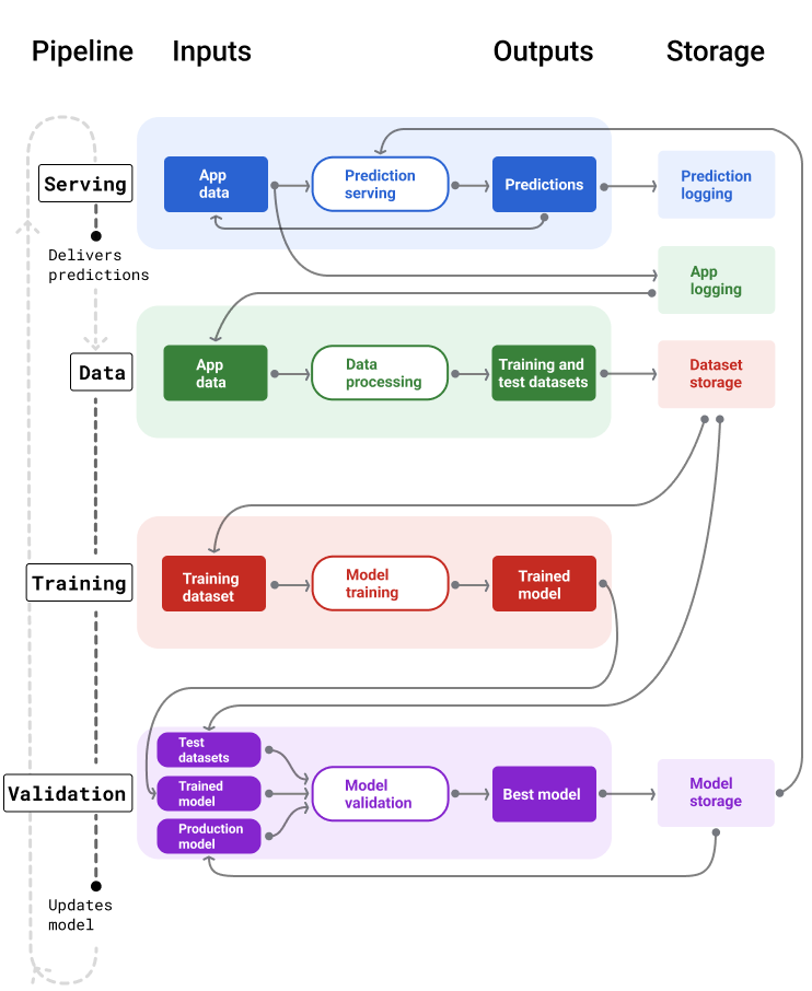
ML Pipelines
Definition
As an ML engineer you should think about workflows and pipelines. How the model you are creating fits in the bigger picture. This is more important when considering edge deployments. For instance, MLOps for the edge model may requires certain over-the-air update capabilites. This therefore governs choice of technology and the hardware platform in some cases.
In this lab, we will do couple of hands-on case-studies for ML to expose you to the end-to-end work flow. By now you should know how to use Co-lab or the Jupyter Notebooks. Both can provide you good starting point.
Case Study: Predicting Air Pollution Levels Using IoT Sensor Data
Problem Statement
Air pollution remains a significant environmental and public-health concern, especially in large urban environments. Modern smart cities rely on IoT-enabled air-quality monitoring stations equipped with multiple chemical and environmental sensors that continuously measure pollutant concentrations and atmospheric conditions.
However, these IoT sensors frequently suffer from several challenges:
- Noise and electronic drift
- Calibration inconsistencies
- Missing or corrupted readings
- Correlated sensor responses
- Slow or varying sensor response times
These issues make pollution monitoring difficult and necessitate predictive models that can enhance or replace unreliable sensor data.
In this case study, the task is to develop a machine learning model that predicts carbon monoxide concentration (CO), measured in mg/m³, using data from an IoT air-quality monitoring station in Italy. The dataset contains hourly averaged measurements from CO, NMHC, NOx, NO₂ sensors, a multi-sensor metal-oxide array, as well as temperature, humidity, and date/time metadata.
Because CO is often missing or affected by noise, a well-designed ML model can provide virtual sensing capabilities, improving data reliability and supporting real-time environmental analytics.
Objectives
- Build a machine learning pipeline to predict CO(GT) using all available IoT sensor features.
- Compare some supervised learning techniques, including:
- Linear Regression
- Decision Trees
- Evaluate model performance using:
- RMSE (Root Mean Squared Error)
- R² (Coefficient of Determination)
- Interpret which sensor features contribute most strongly to CO predictions.
- Connect model results to real-world IoT deployment challenges.
Real-World Motivation
Accurate pollutant estimation is crucial for:
- Early warning systems for sensitive groups
- Smarter traffic routing and congestion control
- HVAC optimization in smart buildings
- Government environmental compliance reporting
- Reducing costs by minimizing hardware failures and recalibration cycles
Machine learning enables virtual sensing, allowing us to improve traditional IoT sensor networks using data-driven predictions rather than only physical measurements.
This case study demonstrates how ML can strengthen IoT systems through data fusion, noise reduction, and predictive modeling.
Getting the Data
Data is the gold mine for the ML. For developing an ML model, we already discussed sufficiency aspects of data. We will be collecting data from the systems you build over course of next few labs. However, for this lab the intention is to expose you to end-to-end workflow. We will therefore be using a public data-set available from UCI Repository. You can explore the full dataset and schema here (Click here).
Air Quality (UCI) — Columns & Meanings
| Column | Type | Units | Meaning / Notes |
|---|---|---|---|
| Date | Feature | DD/MM/YYYY | Date of measurement (day/month/year). |
| Time | Feature (categorical) | HH.MM.SS | Time of the hourly averaged reading. |
| CO(GT) | Target / Feature | mg/m³ | True CO concentration (reference analyzer). |
| PT08.S1(CO) | Sensor response | a.u. | Tin-oxide sensor sensitive to CO (raw reading). |
| NMHC(GT) | Feature | µg/m³ | Non-Methane Hydrocarbons concentration (reference analyzer). |
| C6H6(GT) | Feature | µg/m³ | True Benzene concentration (reference analyzer). |
| PT08.S2(NMHC) | Sensor response | a.u. | Titania sensor sensitive to NMHC (raw reading). |
| NOx(GT) | Feature | ppb | True total Nitrogen Oxides (reference analyzer). |
| PT08.S3(NOx) | Sensor response | a.u. | Tungsten-oxide sensor sensitive to NOx (raw reading). |
| NO2(GT) | Feature | µg/m³ | True NO₂ concentration (reference analyzer). |
| PT08.S4(NO2) | Sensor response | a.u. | Tungsten-oxide sensor nominally sensitive to NO₂. |
| PT08.S5(O3) | Sensor response | a.u. | Indium-oxide sensor sensitive to ozone (raw reading). |
| T | Feature | °C | Temperature at monitoring station. |
| RH | Feature | % | Relative humidity. |
| AH | Feature | g/m³ | Absolute humidity (water vapor content). |
Missing values: The dataset uses -200 as the sentinel value for missing sensor readings.
It contains 9,358 hourly averaged instances recorded from March 2004 to February 2005.
Previously, we have downloaded the data and uploaded it manually to our notebook in Co-Lab. This time we will be writing a snippet which allows this to happen automatically.
import urllib.request
import pandas as pd
import io
import zipfile

def load_air_quality_uci():
    """
    Downloads and loads the Air Quality dataset (UCI) directly from the repository.
    Returns a pandas DataFrame with appropriate parsing.
    """
    url = "https://archive.ics.uci.edu/static/public/360/air+quality.zip"

    # Download ZIP from UCI
    response = urllib.request.urlopen(url)
    zip_data = response.read()

    # Extract and load CSV
    with zipfile.ZipFile(io.BytesIO(zip_data)) as z:
        with z.open("AirQualityUCI.csv") as f:
            df = pd.read_csv(
                f,
                sep=';',       # dataset uses semicolon delimiters
                decimal=',',   # decimal point is a comma
                na_values=-200 # UCI missing value tag
            )
    return df

# Usage example:
df = load_air_quality_uci()
df.head()
The load_air_quality_uci() function automates downloading and loading the Air Quality dataset from the UCI repository. It fetches the ZIP file via urllib, reads it into memory, extracts the CSV, and loads it into a pandas DataFrame while handling dataset-specific quirks such as semicolon separators (;), comma decimals (,), and missing values encoded as -200. The resulting DataFrame is ready for analysis or machine learning tasks without manual downloading or preprocessing.
Quick Tour to "Pandas" Land
Pandas dataframe plays vital role in analysis, transformation, filtering and several other data related operations. Let us take few seconds to look at core operations. Following sinppet gives a brief overview of some functions:
import pandas as pd

# 1. Inspect the first few rows
print("Head of the Table")
print(df.head(5))

# 2. Check basic statistics and data types
print("Basic Info")
df.info()
df.describe()

print("Missing Values")
# 3. Count missing values per column
df.isna().sum()

print("Select by Name Starting")
# 4. Select only sensor columns (PT08.*)
sensor_cols = [col for col in df.columns if col.startswith("PT08")]
df_sensors = df[sensor_cols].head()

print("Filter Rows")
# 5. Filter rows where CO(GT) > 2 mg/m³
high_co = df[df["CO(GT)"] > 2]
high_co.head()

print("Group and Average")
# 6. Compute average CO(GT) by hour (assuming 'Time' column formatted as HH.MM.SS)
df['Hour'] = df['Time'].dropna().str.replace('.', ':', regex=False).str.split(':').str[0]
df['Hour'] = pd.to_numeric(df['Hour'], errors='coerce')
# Now compute average CO(GT) by hour
avg_co_by_hour = df.groupby('Hour')['CO(GT)'].mean()
print(avg_co_by_hour)
By no means, we can cover all aspects of pandas in these labs. I would strongly encourage to use following resources as complementary reading:
-
Pandas Getting Started
Covers installation, basic data structures (Series,DataFrame), I/O, and core operations. -
Pandas User Guide
Detailed reference for functions, indexing, grouping, reshaping, and time series analysis. -
Kaggle “Python and Pandas” Micro-Course
Excellent for beginners and intermediate users. Covers Series, DataFrame manipulation, filtering, grouping, plotting. Hands-on exercises in-browser. -
DataCamp: Pandas Foundations
Structured lessons with interactive coding using real-world datasets. -
Real Python: Pandas Tutorials
Beginner to advanced tutorials, covering merging, reshaping, visualization, and time series.
Data Visualisation and Cleansing
We can visualise the data we loaded using the python library called matplotlib. Alternatively, we can use more fancy third party visualisation libraries, e.g. plotly. As a matter of fact, plotly has a platform called dash which allows you to create dashboards based on the data. Its always good to visualise data before doing anything else. The intuitive feels for features allows formulating hypothesis and testing them much more easy.
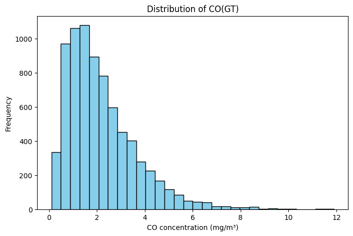
import matplotlib.pyplot as plt
# Example: Histogram of CO concentrations
plt.figure(figsize=(8,5))
plt.hist(df['CO(GT)'].dropna(), bins=30, color='skyblue', edgecolor='black')
plt.title("Distribution of CO(GT)")
plt.xlabel("CO concentration (mg/m³)")
plt.ylabel("Frequency")
plt.show()
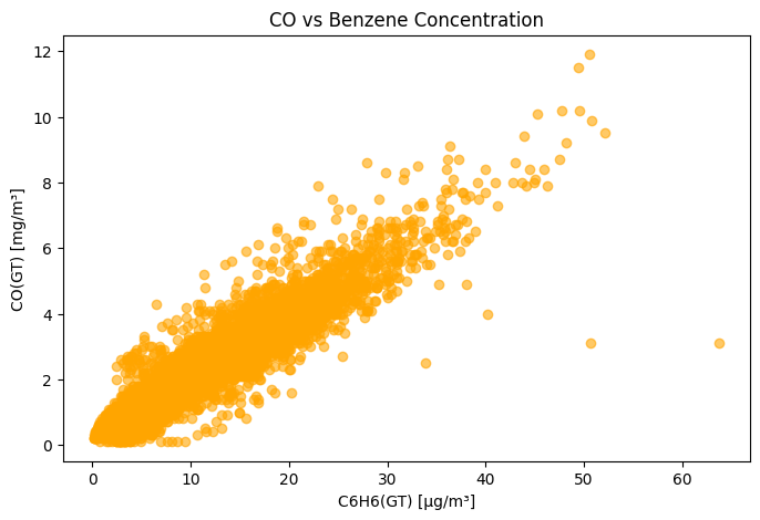
# Example: Scatter plot of CO vs. Benzene
plt.figure(figsize=(8,5))
plt.scatter(df['C6H6(GT)'], df['CO(GT)'], alpha=0.6, color='orange')
plt.title("CO vs Benzene Concentration")
plt.xlabel("C6H6(GT) [µg/m³]")
plt.ylabel("CO(GT) [mg/m³]")
plt.show()
Data Visualisation
The following code allows you to now try plotly distributed via CDN:
## 2. Using Plotly (Interactive) with Heatmap

import plotly.express as px
import plotly.graph_objects as go

# Histogram of CO concentrations
fig = px.histogram(
    df, x='CO(GT)', nbins=30,
    title="Distribution of CO(GT)",
    labels={'CO(GT)': 'CO concentration (mg/m³)'},
    color_discrete_sequence=['skyblue']
)
fig.show()

# Scatter plot of CO vs Benzene
fig2 = px.scatter(
    df, x='C6H6(GT)', y='CO(GT)',
    title="CO vs Benzene Concentration",
    labels={'C6H6(GT)': 'C6H6(GT) [µg/m³]', 'CO(GT)': 'CO(GT) [mg/m³]'},
    color='C6H6(GT)',
    hover_data=['Time', 'Date']
)
fig2.show()

# Correlation heatmap for numerical features
numeric_cols = df.select_dtypes(include='number').columns
corr_matrix = df[numeric_cols].corr()

heatmap = go.Figure(data=go.Heatmap(
    z=corr_matrix.values,
    x=corr_matrix.columns,
    y=corr_matrix.columns,
    colorscale='Viridis',
    zmin=-1, zmax=1
))
heatmap.update_layout(title='Correlation Heatmap of Numerical Features')
heatmap.show()
It is also possible to export the results in interactive HTML format. I have included the output below from such an export. You can hover over and see the data.
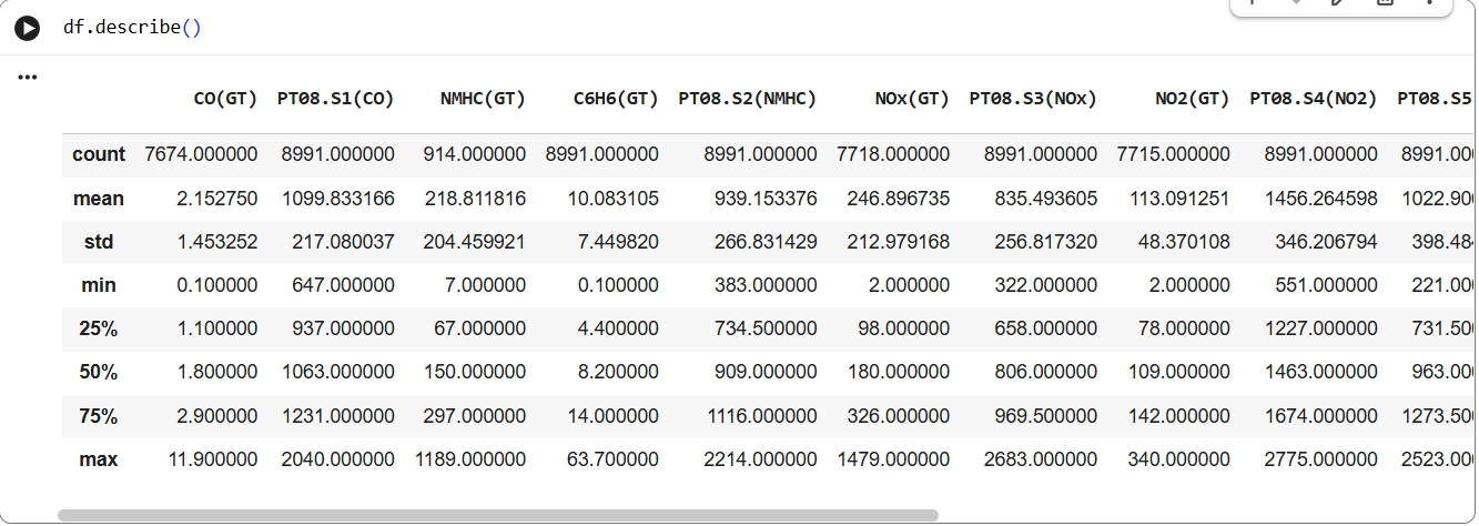
Another interesting command to do exploratory data analysis is df.describe(). Run this command in your notebook. Below is the snapshot of the execution:
Data Analysis
The command shows mean, std, min and quantiles. The df object also exposes capability to plot histogram, you can accomplish this using following snippet:
import matplotlib.pyplot as plt

# Plot histograms for all numeric columns
df.hist(bins=30, figsize=(15, 12), color='skyblue', edgecolor='black')

plt.suptitle("Histograms of All Numeric Columns", fontsize=16)
plt.tight_layout(rect=[0, 0.03, 1, 0.95])
plt.show()
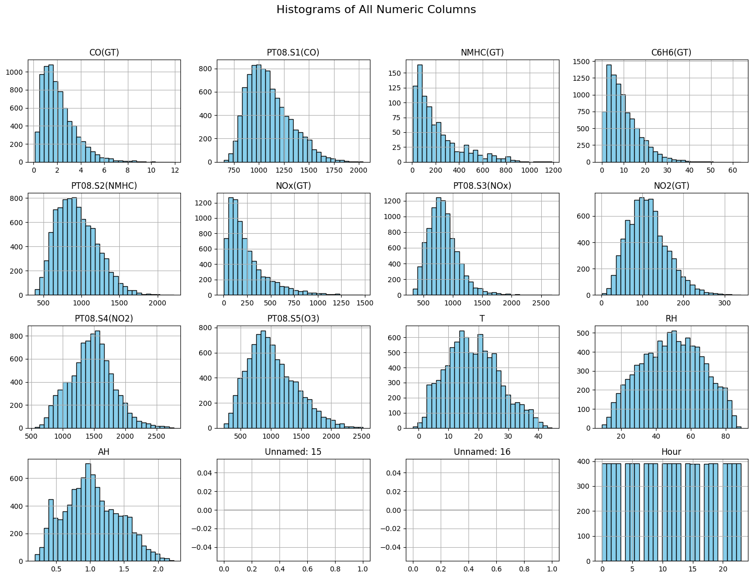
Data Analysis
Regression Task: Predicting CO Concentration
In this case study, we aim to predict the true CO concentration (CO(GT)) from other sensor readings and environmental measurements in the Air Quality dataset.
- Features (
X): Sensor responses (PT08.S1(CO),PT08.S2(NMHC), …), temperature (T), humidity (RH), benzene (C6H6(GT)), and other numeric measurements. - Target (
y):CO(GT)(mg/m³), a continuous value.
This is a supervised regression problem: we want to learn a mapping
We will explore two models:
- Linear Regression – learns a linear combination of features.
- Decision Tree Regression – learns piecewise constant predictions based on feature thresholds, capturing nonlinear relationships.
The goal is to train these models, evaluate performance, and visualize predictions to understand how well each model predicts CO concentrations from the sensor readings.
Dealing with Missing Values
Run the code snippet below to create test and training datasets for linear regression.
# --- 2. Prepare features and target ---
from sklearn.model_selection import train_test_split
from sklearn.linear_model import LinearRegression
from sklearn.tree import DecisionTreeRegressor
from sklearn.metrics import mean_squared_error, r2_score

# Select numeric features
X = df.drop(columns=['CO(GT)']).select_dtypes(include='number')
y = df['CO(GT)']
# Drop rows with NaN
X = X.dropna()
y = y.loc[X.index]

# Train-test split
X_train, X_test, y_train, y_test = train_test_split(X, y, test_size=0.2, random_state=42)
This will fail to execute. What just happened here? We dropped the rows which had Nan. However, all rows had Nan and therefore the dataset is empty. This shows that missing values are part and parcel of the data capture. One should know how to deal with the missing values.
One choice could be to fill the missing data with the mean values. Try the following snippet which accomplishes this:
# --- 2. Prepare features and target ---
from sklearn.model_selection import train_test_split
from sklearn.linear_model import LinearRegression
from sklearn.tree import DecisionTreeRegressor
from sklearn.metrics import mean_squared_error, r2_score

# Select numeric features
X = df.drop(columns=['CO(GT)']).select_dtypes(include='number')
y = df['CO(GT)']


X_clean = X.fillna(X.mean())
y_clean = y.fillna(y.mean())

X_train, X_test, y_train, y_test = train_test_split(X_clean, y_clean, test_size=0.2, random_state=42)
We can make this more robust by using what is known as Imputers. We use a Simple Imputer to fill in these missing values before training:
- SimpleImputer replaces missing values in each column with a summary statistic such as the mean, median, or most frequent value.
- Example strategy:
strategy='mean': fill missing values with the column mean.strategy='median': fill missing values with the column median.strategy='most_frequent': fill missing categorical values with the mode.
- After applying the imputer, the dataset has no NaNs, so it can be safely used for regression or other supervised learning tasks.
from sklearn.impute import SimpleImputer
from sklearn.model_selection import train_test_split
from sklearn.linear_model import LinearRegression


# 1. Select numeric features only
X = df.drop(columns=['CO(GT)']).select_dtypes(include='number')
y = df['CO(GT)']
X = X.dropna(axis=1, how='all')

# 2. Impute missing values in X with column mean
imputer = SimpleImputer(strategy='mean')
X_imputed = imputer.fit_transform(X)  # returns numpy array
# If you want a DataFrame back:
X_imputed = pd.DataFrame(X_imputed, columns=X.columns, index=X.index)

# 3. Drop rows where y is NaN
mask = y.notna()
X_final = X_imputed.loc[mask]
y_final = y.loc[mask]

# 4. Train-test split
X_train, X_test, y_train, y_test = train_test_split(X_final, y_final, test_size=0.2, random_state=42)

# 5. Fit Linear Regression
lr_model = LinearRegression()
lr_model.fit(X_train, y_train)
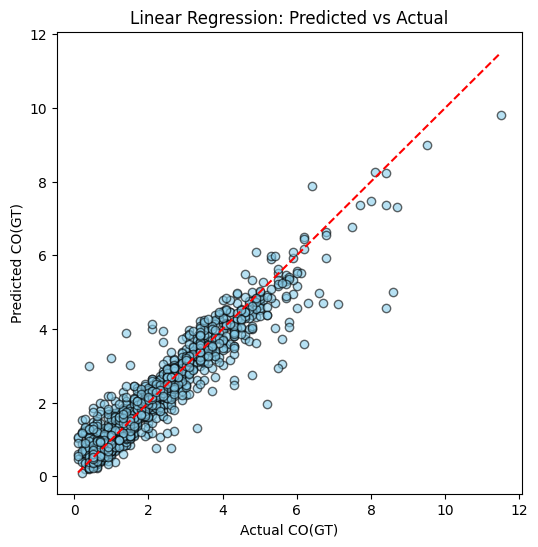
Plotting Predictions
Next we can use the lr_model to get the predictions and visualise the performance of linear predictor:
y_pred_lr = lr_model.predict(X_test)

import matplotlib.pyplot as plt

def plot_predictions(y_test, y_pred, title="Predicted vs Actual"):
    plt.figure(figsize=(6,6))
    plt.scatter(y_test, y_pred, alpha=0.6, color='skyblue', edgecolor='black')
    plt.plot([y_test.min(), y_test.max()], [y_test.min(), y_test.max()], 'r--')
    plt.xlabel("Actual CO(GT)")
    plt.ylabel("Predicted CO(GT)")
    plt.title(title)
    plt.show()

plot_predictions(y_test, y_pred_lr, title="Linear Regression: Predicted vs Actual")
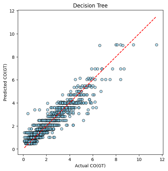
Linear regression is one possible way for supervised learning. The other possible approach is using the Decision Tree:
dt_model = DecisionTreeRegressor(max_depth=5, random_state=42)
dt_model.fit(X_train, y_train)
y_pred_dt = dt_model.predict(X_test)

plot_predictions(y_test, y_pred_dt, title="Decision Tree")
Example of Regression
Example of Classification
Performance Comparison
We ideally want to compare multiple ML models performance to select the best one. There are various performance metric for ML algorithms. The choice of metric depends on the type of problem: regression or classification.
1. Regression Metrics
Regression tasks predict continuous values, such as CO(GT) in the Air Quality dataset. Common metrics include:
- Mean Squared Error (MSE): Measures the average squared difference between predicted and actual values.
where is the actual value and is the predicted value.
- Root Mean Squared Error (RMSE): The square root of MSE, interpretable in the same units as the target variable.
- Mean Absolute Error (MAE): Measures the average absolute difference, less sensitive to outliers than MSE.
- R-squared (R²): Indicates the proportion of variance in the target explained by the model. Closer to 1 is better.
where is the mean of the actual values.
Regression Metrics: Pros and Cons
| Metric | Pros | Cons |
|---|---|---|
| Mean Squared Error (MSE) | Penalizes larger errors more; differentiable for gradient-based optimization; widely used. | Squared units make interpretation less intuitive; sensitive to outliers. |
| Root Mean Squared Error (RMSE) | Same advantages as MSE; interpretable in the same units as the target. | Still sensitive to outliers; can be dominated by large errors. |
| Mean Absolute Error (MAE) | Easy to interpret; less sensitive to outliers than MSE/RMSE. | Not differentiable at zero, which can complicate gradient-based optimization. Look up gradient descent algorithm for more intiution. |
| R-squared (R²) | Measures proportion of variance explained; unitless; intuitive (0 to 1 scale). | Can be misleading for small datasets or when comparing models with different numbers of predictors; does not indicate prediction scale errors. |
2. Classification Metrics
For categorical predictions, common metrics include:
- Accuracy: Fraction of correctly classified samples.
- Precision: Fraction of true positives among predicted positives.
- Recall (Sensitivity): Fraction of true positives among actual positives.
- F1-score: Harmonic mean of precision and recall:
Note
In this tutorial, we focus on regression metrics (MSE, RMSE, R²) to evaluate Linear Regression and Decision Tree models predicting CO concentrations. These metrics allow us to quantify prediction accuracy and model generalization.
Execute following code to get the final evaluation outcome:
def evaluate_model(model, X_train, y_train, X_test, y_test, model_name="Model"):
    y_train_pred = model.predict(X_train)
    y_test_pred = model.predict(X_test)
    train_mse = mean_squared_error(y_train, y_train_pred)
    train_r2 = r2_score(y_train, y_train_pred)
    test_mse = mean_squared_error(y_test, y_test_pred)
    test_r2 = r2_score(y_test, y_test_pred)
    print(f"{model_name} Performance:")
    print(f"  Training set -> MSE: {train_mse:.3f}, R²: {train_r2:.3f}")
    print(f"  Test set     -> MSE: {test_mse:.3f}, R²: {test_r2:.3f}")

evaluate_model(lr_model, X_train, y_train, X_test, y_test, model_name="Linear Regression")
evaluate_model(dt_model, X_train, y_train, X_test, y_test, model_name="Decision Tree")
Example output will be:
| Model | Dataset | MSE | R² |
|---|---|---|---|
| Linear Regression | Training | 0.228 | 0.892 |
| Linear Regression | Test | 0.221 | 0.894 |
| Decision Tree | Training | 0.225 | 0.894 |
| Decision Tree | Test | 0.253 | 0.879 |
Using the values we can test for under-fitting and over-fitting:
Apart from metrics like MSE and R², we can visually inspect model performance using predicted vs actual plots. These plots are useful for understanding how well a model generalizes.
-
Plot setup:
- X-axis → Actual target values (e.g., CO(GT))
- Y-axis → Predicted values
- Ideal predictions lie on the diagonal line (red dashed line)
-
Interpretation:
- Good Fit: Points cluster closely around the diagonal for both training and test sets.
- Overfitting: Points on the training set lie almost perfectly on the diagonal, but the test set points scatter away.
- Underfitting: Points scatter away from the diagonal in both training and test sets, indicating the model cannot capture the underlying pattern.
Correlation Analysis and Dropping the correlated features
Correlated features do not add much value. Try running following code which drops correlated terms, simplifying the input to the model. You will observe performance does not change much.
import numpy as np
import pandas as pd
from sklearn.model_selection import train_test_split
from sklearn.impute import SimpleImputer
from sklearn.linear_model import LinearRegression
from sklearn.tree import DecisionTreeRegressor
from sklearn.metrics import mean_squared_error, r2_score
import seaborn as sns
import matplotlib.pyplot as plt

# --------------------------------------------------------------
# 1. CLEANING: Use only numeric columns + fill missing values
# --------------------------------------------------------------
df_clean = df.select_dtypes(include=[np.number]).copy()

# Remove columns with all missing values
df_clean = df_clean.dropna(axis=1, how='all')

# Remove target rows where output is missing
df_clean = df_clean[df_clean["CO(GT)"].notna()]

# Prepare features/labels
X = df_clean.drop(columns=["CO(GT)"])
y = df_clean["CO(GT)"]

# Impute missing values
imputer = SimpleImputer(strategy="mean")
X_imputed = pd.DataFrame(imputer.fit_transform(X), columns=X.columns, index=X.index)

# Final usable data
X_final = X_imputed
y_final = y

print("Final shape:", X_final.shape)

# --------------------------------------------------------------
# 2. BASELINE MODEL PERFORMANCE (Before removing correlation)
# --------------------------------------------------------------

def evaluate_model(name, model, X_train, X_test, y_train, y_test):
    y_pred_train = model.predict(X_train)
    y_pred_test = model.predict(X_test)
    print(f"\n{name} Performance:")
    print(f"  Train MSE: {mean_squared_error(y_train, y_pred_train):.3f}, R²: {r2_score(y_train, y_pred_train):.3f}")
    print(f"  Test  MSE: {mean_squared_error(y_test, y_pred_test):.3f}, R²: {r2_score(y_test, y_pred_test):.3f}")


X_train, X_test, y_train, y_test = train_test_split(
    X_final, y_final, test_size=0.2, random_state=42
)

# Linear Regression
lr = LinearRegression()
lr.fit(X_train, y_train)
evaluate_model("Linear Regression (Before Corr-Drop)", lr, X_train, X_test, y_train, y_test)

# Decision Tree
dt = DecisionTreeRegressor(max_depth=5, random_state=42)
dt.fit(X_train, y_train)
evaluate_model("Decision Tree (Before Corr-Drop)", dt, X_train, X_test, y_train, y_test)

# --------------------------------------------------------------
# 3. CORRELATION ANALYSIS
# --------------------------------------------------------------

corr_matrix = X_final.corr()

plt.figure(figsize=(12,10))
sns.heatmap(corr_matrix, annot=False, cmap="coolwarm")
plt.title("Correlation Heatmap of Features")
plt.show()

# Identify highly correlated columns
upper = corr_matrix.where(np.triu(np.ones(corr_matrix.shape), k=1).astype(bool))
to_drop = [col for col in upper.columns if any(upper[col].abs() > 0.9)]
print("\nHighly correlated features to drop:", to_drop)

# --------------------------------------------------------------
# 4. DROP CORRELATED FEATURES AND RETRAIN MODELS
# --------------------------------------------------------------

X_reduced = X_final.drop(columns=to_drop)
print("New shape after dropping correlated features:", X_reduced.shape)

X_train_r, X_test_r, y_train_r, y_test_r = train_test_split(
    X_reduced, y_final, test_size=0.2, random_state=42
)

# Linear Regression
lr2 = LinearRegression()
lr2.fit(X_train_r, y_train_r)
evaluate_model("Linear Regression (After Corr-Drop)", lr2, X_train_r, X_test_r, y_train_r, y_test_r)

# Decision Tree
dt2 = DecisionTreeRegressor(max_depth=5, random_state=42)
dt2.fit(X_train_r, y_train_r)
evaluate_model("Decision Tree (After Corr-Drop)", dt2, X_train_r, X_test_r, y_train_r, y_test_r)
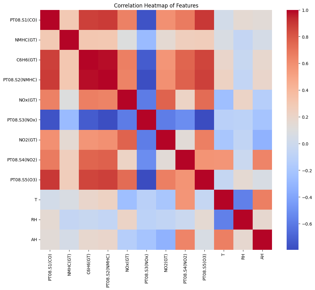
Correlation Matrix for the Features
Hyper-parameter tuning
In machine learning, hyperparameters are configuration settings that shape how a model learns from data but are not learned directly during training. In the case of a Decision Tree Regressor, the most important hyperparameters include max_depth, min_samples_split, and min_samples_leaf. These control how deep the tree can grow, how many samples are required to split a node, and how many samples must remain in a leaf. If these values are set too high, the tree becomes overly complex and overfits, capturing noise in the Air Quality dataset rather than real structure. If set too low, the tree becomes too simple and underfits, failing to learn key pollutant relationships. Because these hyperparameters strongly influence the bias–variance tradeoff, we tune them using tools like GridSearchCV, which systematically tests combinations of settings to find the configuration that provides the best validation performance. This ensures that our Decision Tree model generalizes well when predicting the CO(GT) values in unseen air quality measurements.
Try the following snippet to see the improved performance of the model.
from sklearn.model_selection import GridSearchCV
from sklearn.tree import DecisionTreeRegressor
from sklearn.metrics import r2_score, mean_squared_error

# Define parameter grid
dt_param_grid = {
    "max_depth": [3, 5, 7, 10],
    "min_samples_split": [2, 5, 10],
    "min_samples_leaf": [1, 2, 4]
}

# Create base model
dt = DecisionTreeRegressor(random_state=42)

# Setup GridSearchCV
dt_grid = GridSearchCV(
    estimator=dt,
    param_grid=dt_param_grid,
    cv=5,            # 5-fold cross-validation
    scoring="r2",    # Optimize R²
    n_jobs=-1
)

# Fit on training data
dt_grid.fit(X_train, y_train)

# Best hyperparameters
print("Best hyperparameters:", dt_grid.best_params_)
print("Best CV R² score:", dt_grid.best_score_)

# Evaluate on test set
best_dt = dt_grid.best_estimator_
y_pred_test = best_dt.predict(X_test)
print("Test MSE:", mean_squared_error(y_test, y_pred_test))
print("Test R²:", r2_score(y_test, y_pred_test))
Deployment of Trained Models
Once a machine learning model is trained and validated, the next step is deployment, which allows it to make predictions on new, unseen data in real time or batch mode. There are several ways to deploy models depending on the use case:
- Cloud Lambda Functions: Models can be packaged and served as serverless functions (e.g., AWS Lambda), responding to API requests without managing servers. This is ideal for scalable, event-driven inference.
- Edge Docker Containers: Models can be containerized using Docker and deployed on edge devices or local servers. This enables inference close to the data source, reducing latency and reliance on cloud connectivity.
- WebAssembly (WASM): Lightweight models can be compiled to WebAssembly and run in web browsers or other environments, allowing near-native execution speed and client-side inference without server calls.
- TensorFlow.js Models: TensorFlow-trained models can be exported to the TensorFlow.js format and run directly in the browser or Node.js environment, enabling interactive web applications that perform inference entirely on the client side.
Each deployment approach balances latency, scalability, and hardware constraints, and the choice depends on whether the model needs to run in the cloud, on the edge, or directly in the browser.
Classification example
This tutorial walks through the complete pipeline for Human Activity Recognition (HAR) using the raw accelerometer and gyroscope signals from the UCI HAR Dataset. The dataset contains 6 everyday activities recorded from smartphone IMU sensors.
You will:
-
Download and extract the UCI HAR raw signals
-
Visualize activities and raw windows
-
Build window-level summary features for correlation/EDA
-
Train a 1D CNN on the raw 128×9 sensor streams
-
Evaluate with a confusion matrix and sample predictions
The notebook runs fully end-to-end in Colab or Jupyter.
1. Dataset
We download:
- 9 inertial channels
- 128-length windows
- 6 activity classes
- Train: 7,352 windows
- Test: 2,947 windows
Channel order:
body_acc_xbody_acc_ybody_acc_zbody_gyro_xbody_gyro_ybody_gyro_ztotal_acc_xtotal_acc_ytotal_acc_z
All windows are synchronized (same time length), ideal for CNNs.
# HAR Raw Signals — Fun Notebook (Raw inertial signals)
# Copy into a Jupyter/Colab cell and run end-to-end.
# ---------------------------
# 0. Installs & imports
# ---------------------------
!pip install -q tensorflow seaborn scikit-learn matplotlib
import os, zipfile, urllib.request, random
import numpy as np
import pandas as pd
import matplotlib.pyplot as plt
import seaborn as sns
from glob import glob
from sklearn.decomposition import PCA
from sklearn.metrics import confusion_matrix, classification_report
import tensorflow as tf
from tensorflow.keras import layers, models
RND = 42
np.random.seed(RND)
random.seed(RND)
tf.random.set_seed(RND)
# ---------------------------
# 1. Download & extract UCI HAR dataset
# ---------------------------
url = "https://archive.ics.uci.edu/ml/machine-learning-databases/00240/UCI%20HAR%20Dataset.zip"
zip_name = "UCI_HAR_Dataset.zip"
if not os.path.exists("UCI HAR Dataset"):
print("Downloading UCI HAR dataset (20 MB)...")
urllib.request.urlretrieve(url, zip_name)
with zipfile.ZipFile(zip_name, "r") as z:
z.extractall()
print("Extracted.")
else:
print("Dataset already present.")
# Base path
base = "UCI HAR Dataset"
# ---------------------------
# 2. Helper: load inertial signals for a split (train/test)
# ---------------------------
def load_inertial_signals(split="train"):
"""
Returns X shape (n_windows, 128, 9) and y (n_windows,)
Channels order:
body_acc_x/y/z, body_gyro_x/y/z, total_acc_x/y/z
(we keep a consistent channel order for visualization & modelling)
"""
split_path = os.path.join(base, split, "Inertial Signals")
# Define files in desired order
files_order = [
"body_acc_x_", "body_acc_y_", "body_acc_z_",
"body_gyro_x_", "body_gyro_y_", "body_gyro_z_",
"total_acc_x_", "total_acc_y_", "total_acc_z_"
]
X_channels = []
for prefix in files_order:
fname = os.path.join(split_path, prefix + split + ".txt")
assert os.path.exists(fname), f"Missing {fname}"
# Each file: rows = windows, cols = 128 time steps separated by spaces
arr = np.loadtxt(fname)
# arr shape (n_windows, 128)
X_channels.append(arr[..., np.newaxis]) # make last dim channel
# Concatenate channels -> (n_windows, 128, 9)
X = np.concatenate(X_channels, axis=2)
# Load labels (1..6); convert to 0..5
y_path = os.path.join(base, split, "y_" + split + ".txt")
y = np.loadtxt(y_path).astype(int) - 1
return X, y
# Load train & test
X_train, y_train = load_inertial_signals("train")
X_test, y_test = load_inertial_signals("test")
print("Shapes:", X_train.shape, y_train.shape, X_test.shape, y_test.shape)
# e.g., (7352, 128, 9) (7352,) (2947, 128, 9) (2947,)
# Load activity labels map
act_map = {}
with open(os.path.join(base, "activity_labels.txt"), "r") as f:
for line in f:
idx, name = line.strip().split()
act_map[int(idx)-1] = name
activity_names = [act_map[i] for i in range(len(act_map))]
print("Activities:", activity_names)
# ---------------------------
# 3. Quick EDA & fun plots
# ---------------------------
# (A) Activity distribution (train)
train_counts = pd.Series(y_train).value_counts().sort_index()
plt.figure(figsize=(7,4))
sns.barplot(x=[activity_names[i] for i in train_counts.index], y=train_counts.values, palette="pastel")
plt.xticks(rotation=45)
plt.title("Training set: activity sample counts")
plt.ylabel("Windows")
plt.tight_layout()
plt.show()
# (B) Plot example windows for a few activities
def plot_sample_windows(X, y, activities=[0,1,2], channels_to_plot=[0,3,6], n_samples=2):
"""
channels_to_plot: indices from 0..8 representing channel order above.
"""
fig, axes = plt.subplots(len(activities)*n_samples, len(channels_to_plot), figsize=(14, 3*len(activities)*n_samples))
if axes.ndim == 1: axes = axes[np.newaxis, :]
row = 0
for a in activities:
idxs = np.where(y==a)[0]
sel = np.random.choice(idxs, size=n_samples, replace=False)
for s in sel:
for c_i, ch in enumerate(channels_to_plot):
ax = axes[row, c_i] if axes.ndim>1 else axes[c_i]
ax.plot(X[s,:,ch], alpha=0.9)
ax.set_title(f"Act={activity_names[a]} | channel={ch}")
ax.set_xlabel("time (128)")
ax.grid(alpha=0.2)
row += 1
plt.tight_layout()
plt.show()
# Pick activities: WALKING (0), WALKING_UPSTAIRS (1), SITTING (3) etc.
plot_sample_windows(X_train, y_train, activities=[0,1,3], channels_to_plot=[0,3,6], n_samples=2)
# (C) Compute per-window summary features for correlation (mean/std per channel)
def window_features(X):
# X: (n, 128, 9)
means = X.mean(axis=1) # (n,9)
stds = X.std(axis=1)
# combine to DataFrame
cols = []
for ch in range(X.shape[2]):
cols.append(f"ch{ch}_mean")
for ch in range(X.shape[2]):
cols.append(f"ch{ch}_std")
feats = np.concatenate([means, stds], axis=1)
return pd.DataFrame(feats, columns=cols)
feats_train = window_features(X_train)
# correlation heatmap
plt.figure(figsize=(10,8))
sns.heatmap(feats_train.corr(), cmap="RdBu_r", center=0, vmax=1, vmin=-1)
plt.title("Correlation heatmap of per-window channel mean/std (train)")
plt.tight_layout()
plt.show()
# (D) PCA 2D scatter of windows (using mean features) colored by activity
pca = PCA(n_components=2)
proj = pca.fit_transform(feats_train)
plt.figure(figsize=(8,6))
palette = sns.color_palette("tab10", n_colors=len(activity_names))
for i, name in enumerate(activity_names):
idx = np.where(y_train==i)[0]
plt.scatter(proj[idx,0], proj[idx,1], label=name, s=12, alpha=0.6, color=palette[i])
plt.legend(bbox_to_anchor=(1.05,1))
plt.title("PCA(2) of window-level mean/std features (train)")
plt.xlabel("PC1"); plt.ylabel("PC2")
plt.tight_layout()
plt.show()
# ---------------------------
# 4. Build & train a small 1D-CNN on raw windows
# ---------------------------
num_channels = X_train.shape[2]
timesteps = X_train.shape[1]
num_classes = len(activity_names)
# Simple data pipeline
# Normalize per-channel using training mean/std (channel-wise)
channel_means = X_train.mean(axis=(0,1)) # mean over windows and time -> shape (9,)
channel_stds = X_train.std(axis=(0,1)) + 1e-8
def normalize_X(X):
return (X - channel_means) / channel_stds
X_train_norm = normalize_X(X_train.astype(np.float32))
X_test_norm = normalize_X(X_test.astype(np.float32))
# Build model
def make_cnn():
inp = layers.Input(shape=(timesteps, num_channels))
x = layers.Conv1D(64, kernel_size=3, activation="relu", padding="same")(inp)
x = layers.BatchNormalization()(x)
x = layers.Conv1D(64, kernel_size=3, activation="relu", padding="same")(x)
x = layers.MaxPooling1D(pool_size=2)(x)
x = layers.Conv1D(128, kernel_size=3, activation="relu", padding="same")(x)
x = layers.GlobalAveragePooling1D()(x)
x = layers.Dropout(0.4)(x)
out = layers.Dense(num_classes, activation="softmax")(x)
model = models.Model(inp, out)
model.compile(optimizer="adam", loss="sparse_categorical_crossentropy", metrics=["accuracy"])
return model
model = make_cnn()
model.summary()
# Train
history = model.fit(
X_train_norm, y_train,
validation_split=0.1,
epochs=25,
batch_size=64,
verbose=2
)
# ---------------------------
# 5. Evaluate & show confusion matrix
# ---------------------------
val_loss, val_acc = model.evaluate(X_test_norm, y_test, verbose=0)
print(f"Test accuracy: {val_acc:.4f}, Test loss: {val_loss:.4f}")
y_pred = np.argmax(model.predict(X_test_norm), axis=1)
print("\nClassification report:\n")
print(classification_report(y_test, y_pred, target_names=activity_names))
# Confusion matrix
cm = confusion_matrix(y_test, y_pred)
plt.figure(figsize=(7,6))
sns.heatmap(cm, annot=True, fmt="d", cmap="Blues", xticklabels=activity_names, yticklabels=activity_names)
plt.xticks(rotation=45)
plt.ylabel("True")
plt.xlabel("Predicted")
plt.title("Confusion Matrix (test)")
plt.tight_layout()
plt.show()
# ---------------------------
# 6. Visual check: predicted vs actual for a few samples
# ---------------------------
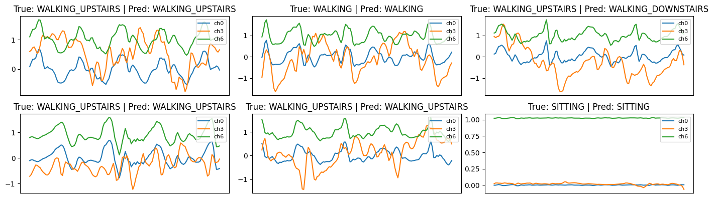
def show_prediction_examples(X, y_true, y_pred, n=6):
idxs = np.random.choice(len(X), size=n, replace=False)
plt.figure(figsize=(14, 3*n//3))
for i, idx in enumerate(idxs):
ax = plt.subplot(n//3 + 1, 3, i+1) if n>3 else plt.subplot(2,3,i+1)
# plot three channels for clarity
ax.plot(X[idx,:,0], label="ch0")
ax.plot(X[idx,:,3], label="ch3")
ax.plot(X[idx,:,6], label="ch6")
ax.set_title(f"True: {activity_names[y_true[idx]]} | Pred: {activity_names[y_pred[idx]]}")
ax.set_xticks([])
ax.legend(loc="upper right", fontsize=8)
plt.tight_layout()
plt.show()
show_prediction_examples(X_test, y_test, y_pred, n=6)
2. Exploratory Analysis
We show:
Activity Distribution
A bar chart confirming roughly balanced classes.
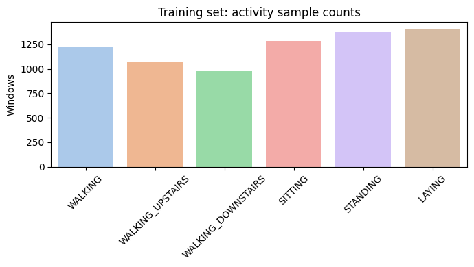
Bar Chart of Class Samples
Raw Signal Windows
Plotting example windows from walking, walking upstairs, and sitting shows distinct patterns:
- Walking → periodic oscillatory accelerometer signals
- Sitting → almost flat
- Gyro channels show movement intensity
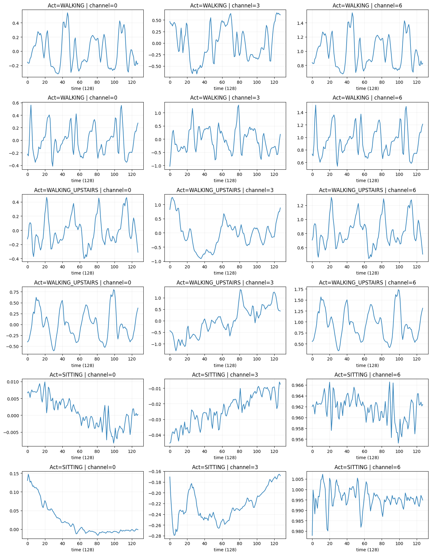
Raw Signals corresponding to activites
Correlation
We compute mean + std per channel per window.
The heatmap highlights strong correlations across axes of the same sensor.
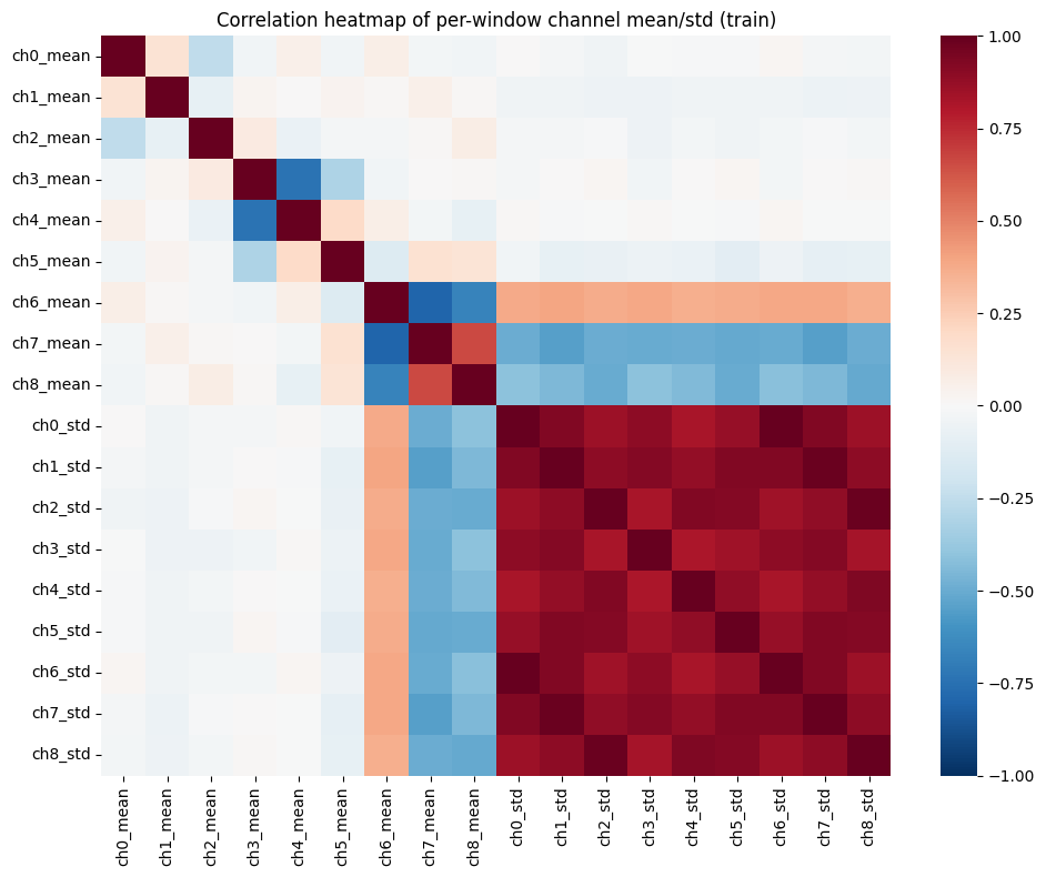
Correlation Plot
PCA
Reduces 18-dimensional window features → 2D for visual separability of activities.
Activities cluster meaningfully, indicating classification is feasible.
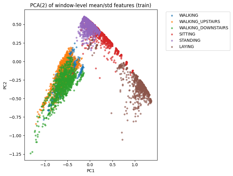
PCA
3. Model — 1D CNN
We normalize signals channel-wise:
- subtract global channel mean
- divide by global channel std
The CNN architecture:
- Conv(64) → BN → Conv(64) → MaxPool
- Conv(128)
- GAP
- Dropout(0.4)
- Dense(softmax)
Trains for 25 epochs.
| Layer (type) | Output Shape | Param # |
|---|---|---|
| InputLayer | (None, 128, 9) | 0 |
| Conv1D (conv1d_3) | (None, 128, 64) | 1,792 |
| BatchNormalization | (None, 128, 64) | 256 |
| Conv1D (conv1d_4) | (None, 128, 64) | 12,352 |
| MaxPooling1D | (None, 64, 64) | 0 |
| Conv1D (conv1d_5) | (None, 64, 128) | 24,704 |
| GlobalAveragePooling1D | (None, 128) | 0 |
| Dropout | (None, 128) | 0 |
| Dense (dense_7) | (None, 6) | 774 |
4. Evaluation
We compute:
- Test Accuracy
- Classification Report
- Confusion Matrix
Walking/Sitting/Standing are highly separable.
Upstairs/Downstairs occasionally confuse.
| Class | Precision | Recall | F1-score | Support |
|---|---|---|---|---|
| WALKING | 0.99 | 0.99 | 0.99 | 496 |
| WALKING_UPSTAIRS | 0.98 | 0.95 | 0.96 | 471 |
| WALKING_DOWNSTAIRS | 0.94 | 1.00 | 0.96 | 420 |
| SITTING | 0.81 | 0.85 | 0.83 | 491 |
| STANDING | 0.87 | 0.81 | 0.84 | 532 |
| LAYING | 0.99 | 1.00 | 1.00 | 537 |
| Accuracy | 0.93 | 2947 | ||
| Macro Avg | 0.93 | 0.93 | 0.93 | 2947 |
| Weighted Avg | 0.93 | 0.93 | 0.93 | 2947 |
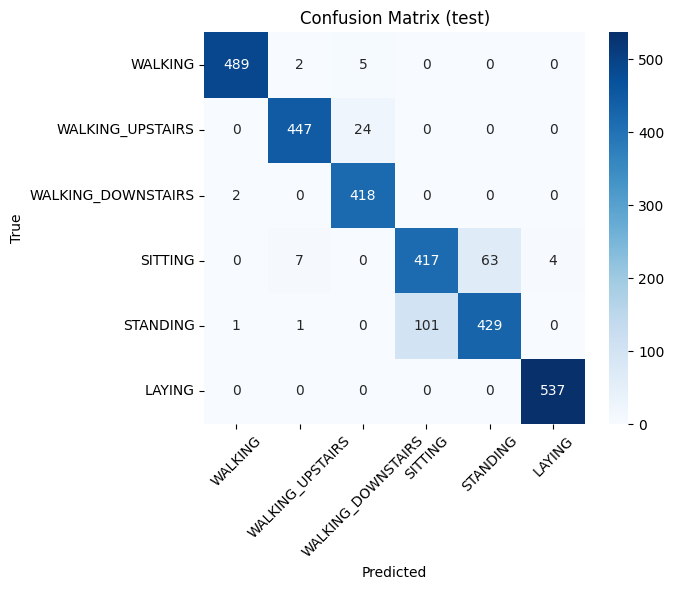
Confusion Matrix
5. Prediction Visualisations
We randomly pick windows and plot 3 channels:
- true vs. predicted label shown in title
This helps visually inspect classification quality and detect failure cases.
Prediction
Summary
This notebook gives a complete workflow:
- Load RAW inertial signals
- Explore signals visually
- Create simple statistical features
- Perform PCA
- Train 1D CNN
- Evaluate & visualize predictions